

For over twenty years, websites have ben the primary place people go to learn about products, services and companies/organizations that they are interested in. See something you like on a TV commercial – go to that company’s website to find out more about it. Notice a billboard for a new service at your local hospital – look up details on the website (after you finish driving of course).
Primary purpose of websites
Back in the day, a website was THE ONLY electronic way to engage with potential buyers and patients. But now, there are a multitude of channels and platforms that marketers can use to entice and interact: email, social media, text, and streaming video, just to name a few.
In this multi-channel, hyper-focused world of digital engagement, what is the primary purpose of a website? Some would say lead generation. Others say raising awareness. Some sites are designed to trigger a specific emotion while others are meant to be educational.
For me, an organization’s primary website should no longer be a swiss-army knife. Gone are the days when it needs to be the lead generator + awareness builder + relationship accelerator + educational resource. Websites can now be singular in focus and purpose.
When I visit an organization’s website, 90% of the time it’s because of a call-to-action from an alternate channel – a search, a card from someone at a conference, an ad on LinkedIn, a Tweet, etc. Within 30s of landing on an organization’s homepage, I want three questions answered, or I will immediately click away:
- What do you do/offer?
- Why should I care?
- How do I find out more?
I find many websites fail on #1 – they bury what their organization does on the About Page or worse, they obfuscate it with fancy marketing words that look good on the screen but do not convey anything meaningful. Below is an example (an amalgam of several websites I visited recently):
- We give companies peace of mind, with our data-driven approach to sales acceleration. Using our platform, 50% of the Fortune 500 are making better, faster decisions based on intent and behavioral data consolidated from trusted internal and external sources.
- We make a CRM analytics platform that will cut your sales cycle by 30%.
If you only had 10s of attention to give, which of the above is easier to digest and understand? I’ll take B all day every day.
After I figure out what an organization does, I immediately want to know why I should care. Some websites use big-name logos on their homepage to demonstrate they are trusted by well-known customers. Others use testimonials, a bulleted list of benefits, or a short (<1min) video to explain how the founder is driven to solve a particular problem because of a personal experience. All of these can be effective at enticing me to learn more.
Homepage Design
There are many theories on homepage design and for the most part, I think any/all of them are valid. Personally, I just want a homepage that:
- Makes it easy for me to find the information I want
- Has a modern, eye-catching layout
- Is mobile-friendly
- Is quick to load (yes there are still sites that take forever to load)
One company that has a great homepage is Citrix: https://www.citrix.com/ They do a fantastic job at keeping their top navigation simple and straightforward. There are no extraneous options or pull-down menus. However, if you look at the footer, there are plenty of other pages that you can explore to find out more information. They layout is eye-catching and there a lot of whitespace which makes it feel more welcoming.
Essential Health, a provider based in Minneapolis with facilities in multiple states, has an amazing homepage https://www.essentiahealth.org/. They have lovely graphics, a nice menu, but what is most impressive is their central navigation bar that helps people get directly to the information they need.
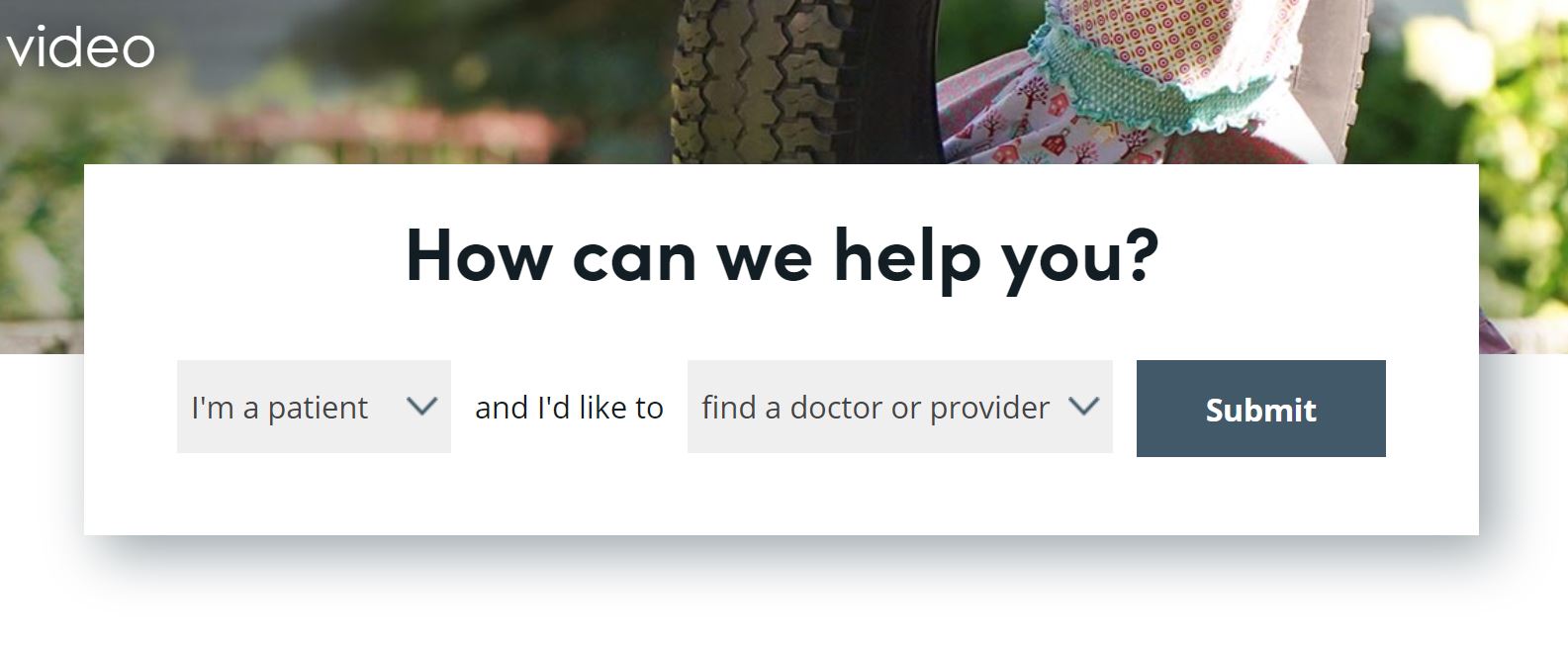
It is clear that Essential has done a lot of work to study how visitors use their website. The right-side drop-down menu is filled with the most common requests that I would have as a patient: find a doctor, make an appointment, find a facility, log into the portal, etc. I choose and I’m brought to the right place. No need to figure out complex mega-menus.
Complex mega-menus are one of my website turn-offs. If I click on the top menu and am suddenly presented with 25+ options with further drill down, I’m out. That’s too much work to find the information I need. I’ll go back to Google and refine my search to find the inner page of your website that has the information I want.
I also really dislike homepages that have a lot of moving elements – scrolling banners, animated gifs, graphics that form as you scroll down, and fancy words for common navigation elements (ie: Contact Us vs Let us Help You).
Blogs
I feel I can’t talk about websites without spending a little time talking about blogs.
A few years ago, everyone was pushing themselves to create their own blogs. Some organizations were even successful at regularly posting new content. Most blogs I see on websites either have sporadic posts or worse, are nothing more than repurposed sales brochures.
For B2B websites, I believe blogs serve one purpose – to help with SEO. That’s it.
Think about it. How many company blogs do you read and trust vs how many online media sites do you turn to for unbiased information? (Note the exception for me is HubSpot. I LOVE LOVE LOVE their company blog). If I’m looking for thought-leadership or an opinion, I’m much more likely to consume it on LinkedIn, YouTube or an industry media site. A company’s website is not the first place I would go
This doesn’t mean I’m against content marketing. Far from it, I think companies should continue to invest in creating whitepapers, explainer videos, and technical product content for their own websites. However, I believe that it’s wasted effort to try and make your company blog into an information destination. Use it to improve your SEO…and for goodness sake, please post at least once a month.
What’s your opinion?
The next #HITMC monthly tweetchat will be held Tuesday September 17th at noon ET (9am PT) – for your local time click here. Below are the questions we will be discussing:
- T1 What is the primary purpose of a website? To inform? Lead generation? Motivate action? Encourage further engagement?
- T2 What will immediately sour you on a website and cause you to lose interest right away?
- T3 If you could design your dream website, what three words would users/visitors use to describe their experience with it?
- T4 Is there still value in maintaining blogs on an organization’s site? What goals (if any) should be set for the blog?
- T5 What is one thing that you would like to see companies/organizations START doing on their websites? and STOP doing?
- BONUS Share the website designs that inspire you!


Add Comment